The Crayonz JournalDesign ideas
T-Shirt Design Ideas: 55 Prints Worth Making
Fifty-five design ideas built the way a shirt actually prints, grouped by style, each with a prompt you can drop straight into the studio.
By the Crayonz team7 min read
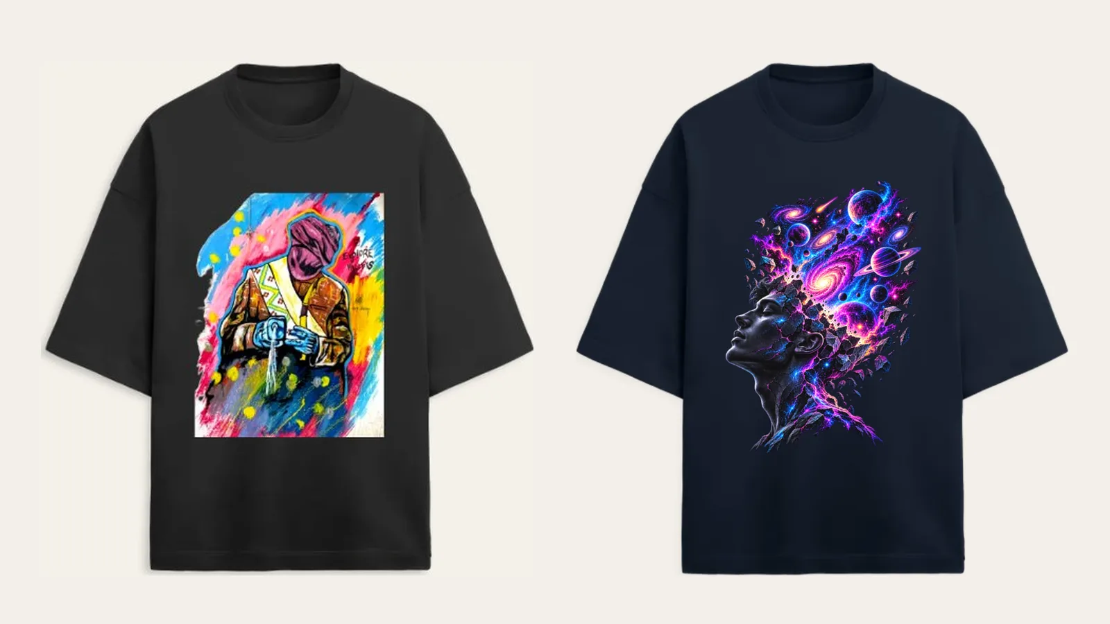
Most "t shirt design ideas" lists are stock graphics pasted onto a product photo, the same handful of ideas copied across fifty sites. None of them tell you what actually prints well, and none let you use your own photo or words instead.
Every idea below works in the studio: upload your own image, logo or photo, or describe the idea in a few words and the AI draws it in about a minute. Either way, you place it yourself on the garment, chest, back or sleeve, pick a colour, and order one piece. No minimum, no setup fee.
A few of these need real width, a big back print or a full-chest graphic, and for those the Oversized Terry Tee gives you the most room to work with, front and back.
Typography
Type alone, no illustration, works when the words are strong enough to carry the shirt by themselves.
One bold word, stacked two lines
Pick a short word, three to seven letters, and stack it across two bold lines on the chest. The shorter the word, the bigger each line can run.
bold condensed sans-serif typography of "[your word]", stacked in two lines, centered chest placement, single colour ink, plain background, print-ready
Your initials, in a serif nobody expects
Two or three letters, set small and fine instead of bold and loud. It reads as considered rather than decorative, especially close to the shirt colour.
fine serif typography of "[your initials]", small centered chest placement, single colour ink, plain background, print-ready
A sentence that breaks mid-line on purpose
Run a short line across the full back and cut it at an odd word instead of a natural pause. The break is the design.
bold condensed sans-serif typography of a short sentence, broken across two lines at an unexpected point, full back placement, single colour ink, plain background, print-ready
- A single lowercase letter, oversized and dead centre.
- Your city's name set in a condensed athletic font.
Minimal line art
A single unbroken line reads as considered even when the subject is simple, and it never fights with the garment colour underneath it.
A mountain range in one unbroken line
A horizon drawn without lifting the pen, small on the chest. Works in almost any ink colour because there's nothing to shade.
minimal single continuous line-art illustration of a mountain range, no shading, small chest placement, single colour, plain background, print-ready
A single flower stem, line only
One stem, one bloom, drawn as a continuous outline with no fill. Quiet enough to wear every day.
minimal single continuous line-art illustration of a flower stem, no shading, small chest placement, single colour, plain background, print-ready
A city skyline flattened to one line
A handful of buildings reduced to their outline and nothing else, running low across the chest like a horizon.
minimal line-art illustration of a city skyline, flat single-line style, small chest placement, single colour, plain background, print-ready
- A paper plane mid-flight, line only.
- A single question mark, nothing else.
Retro and vintage
Nothing here copies a specific brand or a specific decade exactly, just the textures: grain, pixels, a cracked print, the look of something washed a hundred times.
A fake cassette tape label
Your own line set like a mixtape label, side A and side B included. Works best in a colour that actually looks aged.
retro cassette-tape label graphic with "[your line]" as the title, bold rounded type, side A and side B markings, single colour, plain background, print-ready
A sunset drawn like an old arcade cabinet
Flat bands of colour and a hard pixel edge instead of a soft gradient. It reads instantly as retro without copying anyone's specific game.
retro pixel-art style sunset graphic, flat horizontal colour bands, hard pixel edges, limited colour palette, plain background, print-ready
A cracked varsity number, aged on purpose
A single large number in a varsity-style block font, with a distressed, cracked print texture built in. Suits the varsity jacket better than almost anything else on this list.
bold varsity-style number typography with a distressed cracked-print texture, large chest placement, single colour, plain background, print-ready
- A grainy halftone version of any photo you upload (ask the AI for the halftone look).
- A boxy 1970s logotype with softened corners.
- An old film-camera date stamp, small in a corner.
Streetwear back prints
Bigger than a chest graphic and meant to be read from behind, these lean on the Oversized Terry Tee's full back print area.
A single word, the full width of the back
One word, sized to the full back print area, nothing else on the shirt. The size does the work a slogan would otherwise have to.
bold condensed sans-serif typography of one word, filling the full back print area edge to edge, single colour ink, plain background, print-ready
A boxed mark on the back, echoed small on the sleeve
A simple boxed logo-style graphic on the back, repeated tiny on the sleeve so it reads as a set rather than two separate prints.
boxed logo-style graphic with bold lettering inside a rectangle border, back placement with a smaller matching sleeve mark, single colour, plain background, print-ready
A graphic that bleeds off both shoulders
Art sized past the usual back boundary so it feels like it continues under the sleeves, even though the print itself stops at the seam.
large bold graphic illustration sized to bleed toward both shoulder seams, full back placement, single colour, plain background, print-ready
- A back print with a small matching chest hit.
- An oversized reversed-out silhouette, back only.
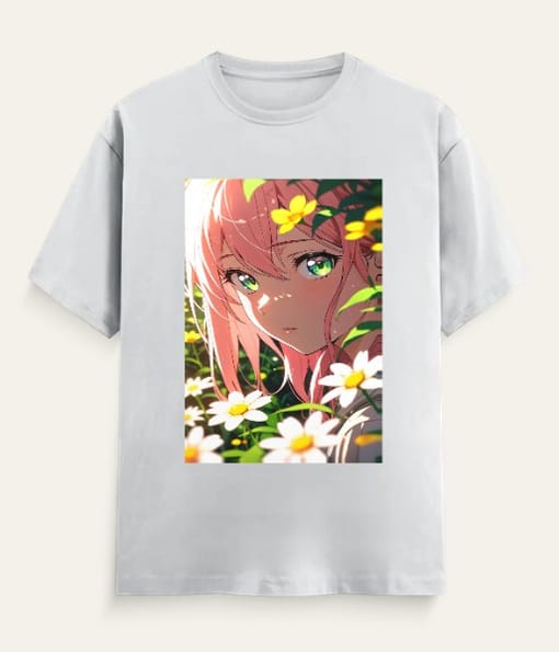
Original anime-inspired
Anime style, not anime characters. Nothing below names or draws anyone from a specific show, just the look: clean linework and soft cel shading.
A lone figure walking through falling cherry blossoms
A single silhouette, head down, petals falling around them, drawn in clean anime linework with soft cel shading. No character, just a mood.
anime-style illustration of a lone silhouetted figure walking through falling cherry blossoms, clean linework, soft cel shading, chest placement, print-ready
A single giant eye, cel-shaded
One eye, drawn large and detailed in anime style, reflecting a small scene inside the iris. Works best big, so it reads as the whole design.
anime-style cel-shaded illustration of a single large detailed eye with a small reflected scene inside the iris, chest placement, print-ready
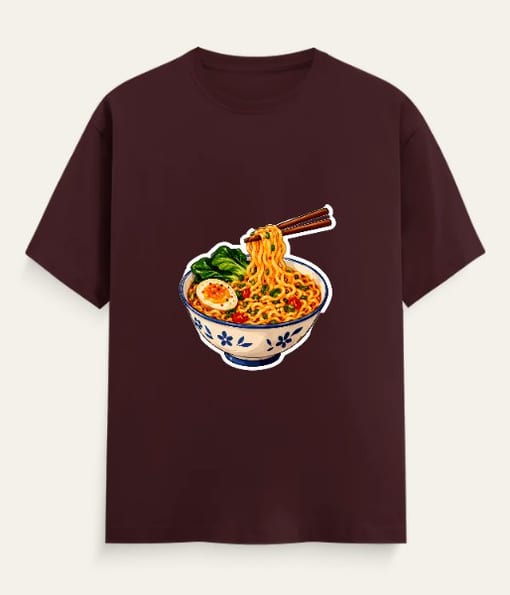
A bowl of ramen, steaming, in clean anime linework
Chopsticks mid-lift, steam curling up in soft lines, drawn the way food looks in an anime still. Warm, simple, easy to wear often.
anime-style illustration of a steaming ramen bowl with chopsticks, clean linework, soft cel shading, chest placement, print-ready
- A cat on a windowsill at sunset, anime palette.
- A hand reaching toward falling stars, cel-shaded.
- A night skyline with neon streaks, anime colour grading.
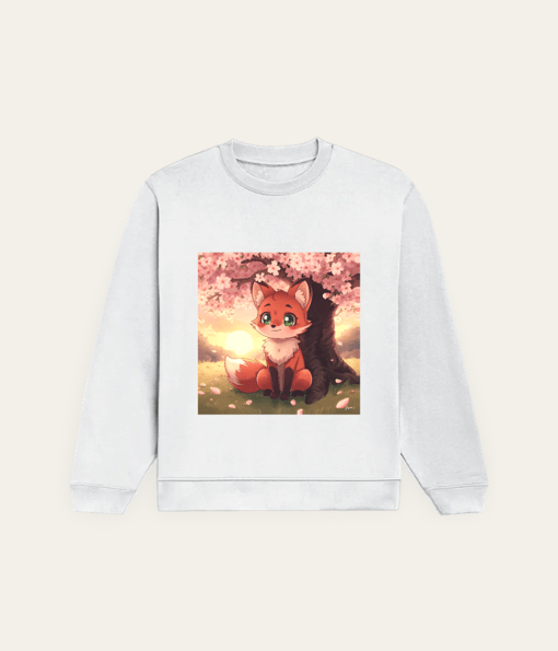
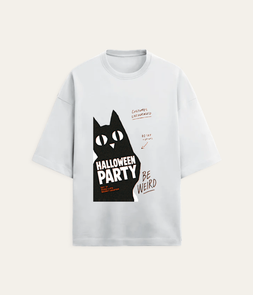
A few anime favourites, ready to order
Food
The most specific version of a food idea almost always beats the generic one, your actual order over a stock illustration of a dish.
A single samosa, drawn like a logo
One samosa, flat vector style, clean outline, sized small like a badge rather than a full illustration. Reads instantly, prints cheap.
flat vector illustration of a single samosa in a clean badge-style outline, small chest placement, single colour, plain background, print-ready
Your usual order, printed like a receipt
A till-receipt graphic listing your actual regular order, line by line, with a total at the bottom. Specific beats generic every time.
monospace till-receipt graphic listing "[your usual order]" as line items with a total, dot-matrix style font, single colour, plain background, print-ready
A fried egg, drawn as a smiley face
The yolk as an eye, the white as the rest of the face, kept flat and simple so it reads as a joke and not a food photo.
flat vector illustration of a fried egg styled as a smiley face, clean outline, single colour accent, plain background, print-ready
- A steaming cup of chai, line art only.
- A stack of parathas, flat illustration.
Travel
Built around a real trip rather than a generic wanderlust print, so the shirt still means something once you're home and unpacking.
A boarding pass for the trip you're planning
Real city names and a real date, laid out like an actual boarding pass. Fill in the blank with wherever you're actually headed.
minimal boarding-pass style graphic with city names and a date reading "[your destination]", condensed sans-serif type, single colour, plain background, print-ready
A map pin dropped on your next stop
A simple line-art pin with coordinates or a place name underneath. No skyline needed, the pin alone says enough.
minimalist line-art map pin illustration with "[your destination]" in small type beneath, single colour line work, plain background, print-ready
- A compass rose, line art only.
- A luggage tag stamped with your initials.
Pets
A real pet, redrawn, beats a generic animal icon every time, and the studio can work directly from an uploaded photo.
Your pet, redrawn as a single continuous line
Upload a clear photo and the studio redraws it as one unbroken line with no shading. The pet carries the design, not the colour.
turn the uploaded photo of your pet into a minimal single continuous line-art illustration, no shading, chest placement, single colour, plain background, print-ready
A paw print trail, walking off the edge
A line of paw prints that starts small on the chest and fades toward the shoulder, as if they're mid-step.
minimal line-art paw print trail graphic, fading in size toward the shoulder, chest placement, single colour, plain background, print-ready
- A cartoon pair of dog ears, minimal outline.
- A cat curled into a comma shape, line art only.
Sports, without the crest
No club badges, no player names, just the equipment and the energy. These work for anyone who plays, not just one team's fans.
Your lucky number, nothing else
One number, set big in a plain athletic font, no team name or crest attached to it. The number does all the talking.
bold athletic block-number typography of "[your number]", centered chest placement, single colour, plain background, print-ready
A gully cricket bat and ball, flat icon style
A simple bat-and-ball icon, flat colour, no logos, the kind of graphic that reads as sport in general rather than any specific team.
flat vector icon illustration of a cricket bat and ball, clean outline, small chest placement, single colour, plain background, print-ready
- A badminton shuttlecock mid-arc, line art only.
- A running shoe silhouette, minimal outline.
Coding
The jokes that land hardest are the ones only another developer would read twice, not the ones aimed at a general audience.
A terminal prompt, with your own line typed in
A plain command-line graphic with your actual line of text typed after the prompt symbol, monospace, nothing decorative around it.
monospace terminal-prompt style graphic reading "[your line of code]" after a command-line cursor, small centered chest placement, single colour, plain background, print-ready
A commit message, printed like a receipt
Your actual last commit message, set in monospace on a till-receipt layout. Funnier the more mundane the message actually was.
monospace till-receipt graphic with "[your commit message]" as the single line item, dot-matrix style font, single colour, plain background, print-ready
Tabs versus spaces, settled for good
A simple scoreboard graphic declaring a winner, printed like it's an official ruling rather than an opinion.
flat scoreboard-style graphic declaring a winner between two short labels, bold condensed type, single colour, plain background, print-ready
- A single semicolon, oversized and alone.
- A loading spinner, frozen mid-spin.
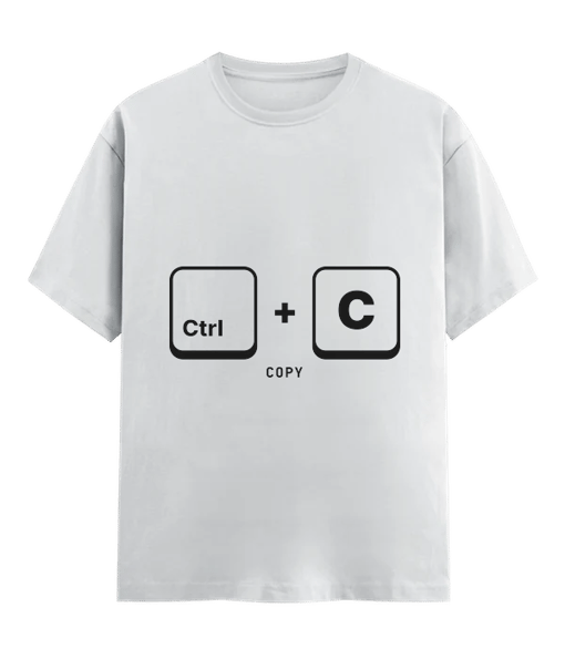
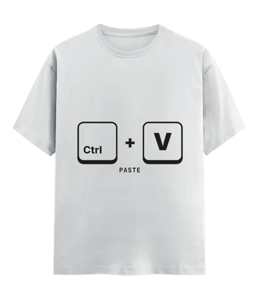
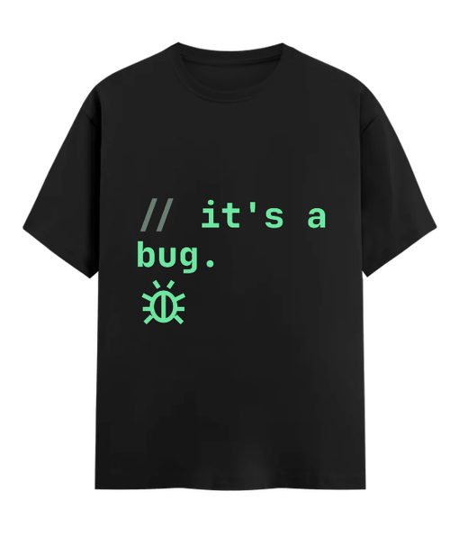
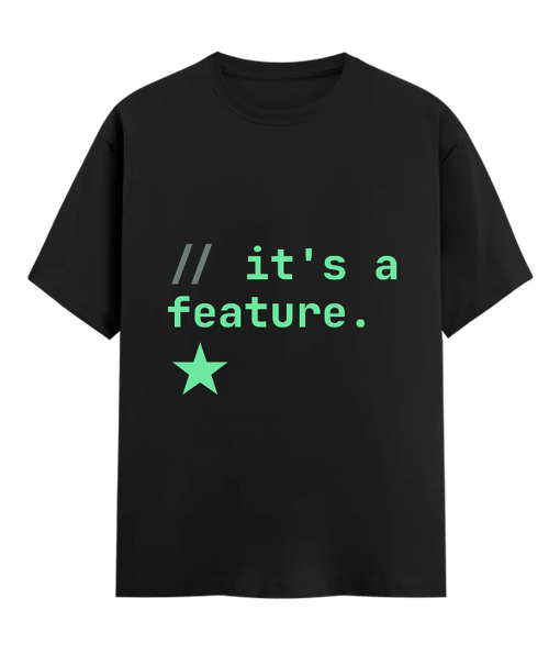
Coding in-jokes, already printed
Indian everyday life
Specific beats generic here too. A real line from a real household reads funnier printed than any stock Indian-themed graphic.
Mummy's voice note, transcribed exactly
The actual line from a real voice note, typed out word for word, including the part that doesn't quite make sense out of context.
handwritten-script style typography of "[the exact line]", small centered chest placement, single colour ink, plain background, print-ready
The fan left on, the light left on, both
A deadpan line about the two things apparently never switched off in any Indian household, set plain and bold.
bold condensed typography reading "the fan is on, the light is on, both", two-line stack, centered chest placement, single colour ink, plain background, print-ready
An auto meter, stuck on a number that means something
A simple meter-display graphic frozen on a number that matters to you, a birthday, a house number, a lucky figure.
flat graphic of a digital meter display frozen on "[your number]", clean outline style, small chest placement, single colour, plain background, print-ready
- A steel tiffin box, drawn as a flat icon.
- A rangoli pattern, simplified to line art.
- A cricket commentary line, printed like a scoreboard.
8 rules for designs that print well
- Contrast with the garment colour. A dark print on a dark shirt disappears. Check the mockup in the colour you are actually ordering, not the default preview.
- Match the idea to the print-area size. A design built for the chest looks thin stretched across the back, and a back-sized graphic looks oversized shrunk onto the chest. Decide the placement before you build the art.
- Keep line weight thick enough to survive a wash. A fine serif or a thin signature prints cleanly on paper but can go patchy on fabric. Thicken fine lines before you upload them.
- Upload a transparent PNG, not a white square. A transparent background lets the ink sit directly on the garment colour. A white background prints as a visible box around your design.
- Decide the placement first. Front, back, sleeve or pocket, each one reads differently and changes how big the art should be. Pick it before you design, not after.
- Limit the colour count. Two or three flat colours print cleaner and cheaper-looking than a busy gradient. Save gradients for photo uploads, not drawn graphics.
- Size text bigger than feels natural. Anything smaller than a thumbnail from three feet away won't read once it's on a moving body. Err on the larger side.
- Write the loud line for the back, the quiet one for the chest. A back print has more room and gets seen from a distance; a front print gets seen face to face.
| Print style | Best placement | Best garment |
|---|---|---|
| Bold one-word typography | Chest, centred | Classic T-Shirt |
| Big illustrated graphic | Full chest or full back | Oversized Terry Tee |
| Fine line art | Small, chest | Classic T-Shirt |
| Statement back print | Back, large | Oversized Terry Tee |
| Small logo-style mark | Sleeve or pocket | Classic Heavyweight Hoodie |
| Winter graphic | Chest or back | Classic Heavyweight Hoodie |
A good t-shirt design is not the one that photographs best in a mockup. It's the one you'd still reach for a year later.
Questions people ask
What size should a t shirt design actually be?
There's no single number, because it depends on the garment and the placement. A chest design usually stays smaller and holds more detail; a back design, especially on the Oversized Terry Tee, can run large, close to edge to edge. Build the design at the size you want it to read, then check it against the dashed print-area outline in the studio before you place it.
Can I upload my own photo instead of using one of these ideas?
Yes. Most of what gets ordered is exactly that, an uploaded photo or logo placed directly on the garment. Use any idea here as a layout to copy and swap in your own image.
Does my design need a transparent background?
A transparent high-resolution PNG prints cleanest, because the ink sits on the garment colour instead of on a visible white box. If you're describing an idea for the AI to draw, the studio's Remove background tool handles this in one tap.
Which shirt works best for a big back print?
The Oversized Terry Tee. It has a drop-shoulder fit with a large front and back print area, so a graphic that would look cramped on a classic tee has real room to run.
Is there a minimum order to print just one design?
No. Pricing is per piece at any quantity, with no minimum order and no setup fee, so printing one shirt costs exactly what that one shirt costs.
How long does a printed design take to arrive?
Every piece is made after you order. It ships in 2 to 3 days and arrives in 4 to 8 days across India, a little longer for remote pin codes. Delivery also reaches 25 more countries in 1 to 3 weeks.
Your idea, on a shirt, this week.
Upload a photo or describe it. One piece, no minimum, arrives in 4 to 8 days across India.